If patients can’t find you—or can’t reach you—they’re gone. A clunky or buried contact page quietly kills conversion. Common issues we see: Contact page hidden in a dropdown or footer No clickable phone number (especially on mobile) Broken or confusing contact forms...
It’s not about fancy design or animations. The best surgery center websites win by being clear, fast, and trustworthy. Here’s what matters most: Clear procedures listed: No guessing what you actually do Fast load times: Especially on mobile—patients won’t wait...
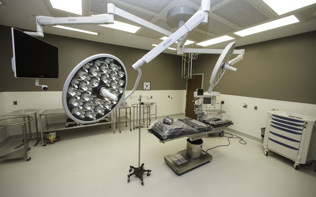
Office photos can build trust—or break it. The right images show patients what to expect, create a sense of calm, and help you stand out from cold, generic competitors. But bad photos? They do more harm than good. They make your practice feel outdated, messy, or...
Just launched your practice website? Before you call it done, make sure you’ve covered the essentials. Here’s a 7-item checklist every new medical site should have from day one: Clear contact info (not buried at the bottom) Online appointment request or call-to-action...
Referring physicians are busy. If your surgery center’s website makes them hunt for forms, contact info, or instructions—they’ll stop referring. Your site should make sending a patient to you frictionless. That means: Referral forms are one click away Contact info is...
Putting your patient portal front and center on your homepage might feel helpful—but it’s probably hurting your site more than helping. Most first-time visitors aren’t looking to log in. They’re trying to figure out: What kind of care you provide Where you’re...


Recent Comments