Why Fonts Matter More Than Most Schools Think
Your school’s font is doing a job long before a tour, an open house, or a conversation with admissions.
It shows up on your website.
On your logo.
On tuition PDFs.
On the sign parents read while sitting in the carpool line, coffee cooling in the cupholder.
Parents may not know the names of fonts. They absolutely feel them.
A sharp, techy font can quietly signal “startup.”
A whimsical font can feel unserious.
A stiff, old-school font can feel dusty and frozen in time.
The goal is not to look ancient. The goal is to look trustworthy, thoughtful, and calm without feeling trapped in 1890.
That is the tension classical schools live in.
Picture this: a school uses a novelty font because it feels “creative.” Parents read it and think, “Something here feels dated,” even if they can’t explain why.
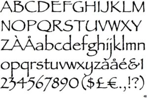
Papyrus is often used this way. At one point it felt fresh and expressive. Today, it tends to read as dated.
The Real Branding Problem Classical Schools Face
Here is the actual issue, stripped of education jargon.
Parents want two things at once.
They want stability.
They also want their child to live in the modern world and not feel like they stepped into a museum.
Fonts sit right at that intersection.
Too modern, and families worry the school is just another trendy experiment.
Too old, and they worry the school is out of touch, rigid, or hostile to anything new.
The sweet spot is a font that feels rooted, but readable. Traditional, but alive.
What “Classical” Really Looks Like to a Parent
Most parents are not thinking about Roman inscriptions or medieval manuscripts.
They are thinking:
- Can I read this easily on my phone?
- Does this feel serious without being stuffy?
- Would I trust this school with my child?
A classical-feeling font today usually means:
- Clear letter shapes
- Balanced spacing
- No gimmicks
- No extreme quirks
Think less “old book from the attic” and more “hardcover book you actually want to read.”
Serif Fonts: Still the Backbone of Classical Branding
Serif fonts are the backbone for a reason.
Those small strokes at the ends of letters help guide the eye. That makes long reading easier. Parents may not articulate it, but they feel less tired reading serif text.
The mistake schools make is choosing the wrong serif.
Good Modern Serif Traits
- Clean lines without excessive ornament
- Moderate contrast between thick and thin strokes
- Open counters, meaning the inner spaces of letters are not cramped
You want a serif that feels like a well-edited book, not a wedding invitation from 2003.
Examples Parents Instantly Understand
Imagine a tuition guide set in a tight, decorative serif with tiny spacing. Parents squint. They scroll faster. They feel stressed.
Now imagine that same guide set in a calm serif with generous spacing. It feels organized. Predictable. Safe.
That emotional shift happens before a single word is processed.
Sans Serif Fonts Are Not the Enemy
There is a myth floating around classical education circles that sans serif fonts are somehow modern in a bad way.
That is nonsense.
Sans serif fonts are tools. Used well, they make information easier to digest.
Used poorly, they make everything feel like a tech startup pitch deck.
Where Sans Serif Fonts Shine
- Navigation menus
- Buttons
- Short labels
- Forms and applications
Parents filling out an enrollment form at 9:30 pm do not want to fight your font.
They want clarity. They want speed. They want to finish and go to bed.
The Right Balance
A common, effective setup:
- Serif font for headlines and body text
- Simple sans serif for navigation and utility text
This mirrors what parents already trust. Books. Newspapers. Professional publications.
Nothing feels experimental. Nothing feels forced.
Fonts That Feel Timeless Without Feeling Old
Here is a mental filter that works.
Ask one question:
Would this font look strange on a school website ten years ago or ten years from now?
If the answer is yes, it is probably too trendy.
Good classical branding avoids trends by default.
What to Avoid Immediately
- Ultra-thin fonts
- Overly compressed letter spacing
- Fonts designed primarily for logos used everywhere else
- Anything that feels “fashionable”
Fashion ages fast. Schools should not.
How Fonts Shape Trust, Not Just Style
Trust is built from small signals stacking up.
Parents notice:
- Is the website easy to read?
- Does the logo feel thoughtful?
- Do documents feel consistent?
A mismatched font system creates quiet friction.
One PDF looks different from the website.
The newsletter uses something else entirely.
The logo font shows up nowhere else.
Parents may not complain. They just feel something is off.
Consistency communicates competence.
What Parents Actually Experience in Real Life
Picture this.
A mom opens your site on her phone during a soccer practice.
Bright sun.
Small screen.
One hand holding a water bottle.
If your font is tight, decorative, or low contrast, she scrolls faster. She misses details. She feels tired.
If your font is calm and readable, she stays. She reads. She clicks.
That is branding doing real work.
Logos Are Not the Whole System
Many schools pour all their energy into a logo and ignore everything else.
That is backwards.
A logo might be seen for three seconds.
Your website, emails, and documents live with families for years.
Fonts carry the brand day after day.
A strong system:
- Uses one primary serif
- Uses one supporting sans serif
- Applies them consistently
No improvising. No guessing.
Print Still Matters More Than You Think
Even in a digital world, classical schools print a lot.
Enrollment packets.
Handbooks.
Event flyers.
Fundraising materials.
Fonts that look good on a screen but fall apart in print are a liability.
If your serif gets muddy when printed or your sans serif feels cold on paper, parents notice. They may not say it out loud, but they feel it.
Good fonts survive both worlds.
Choosing Fonts Is a Leadership Decision
This is not a task to delegate to whoever “likes design.”
Fonts communicate values.
They communicate seriousness.
They communicate care.
When done right, they fade into the background and let the school’s mission speak.
When done wrong, they quietly undermine trust.
Simple Rules to Get This Right
- Prioritize readability over personality
- Choose fonts that feel calm, not clever
- Limit the number of fonts used
- Test fonts on phones, tablets, and printed pages
If you cannot imagine a parent comfortably reading a tuition page on their phone, change the font.
The Big Takeaway
Modern fonts can absolutely feel classical.
The best ones do not shout.
They do not perform.
They simply work.
They make parents feel steady.
They make information feel approachable.
They make the school feel like a place that knows who it is.
That is what good branding does.
And it starts with letters on a page.
0 Comments